RIPTA Identity
Hypothetical visual identity for the Rhode Island Public Transit Authority (RIPTA), drawing on classic visual markers of Rhode Island.
Identity Design
Typeface: Akkurat
![]()
![]()
The logomark combines the form of an anchor—an iconic marker of Rhode Island present in both the state flag and state seal—with an arrow, referencing transportation and efficiency. The full logo, at right, has two variations: one with the agency’s acronoym and another with its more formal, official name.
RIPTA Identity
Hypothetical visual identity for the Rhode Island Public Transit Authority (RIPTA), drawing on classic visual markers of Rhode Island.
Identity Design
Typeface: Akkurat
Typeface: Akkurat


The logomark combines the form of an anchor—an iconic marker of Rhode Island present in both the state flag and state seal—with an arrow, referencing transportation and efficiency. The full logo, at right, has two variations: one with the agency’s acronoym and another with its more formal, official name.

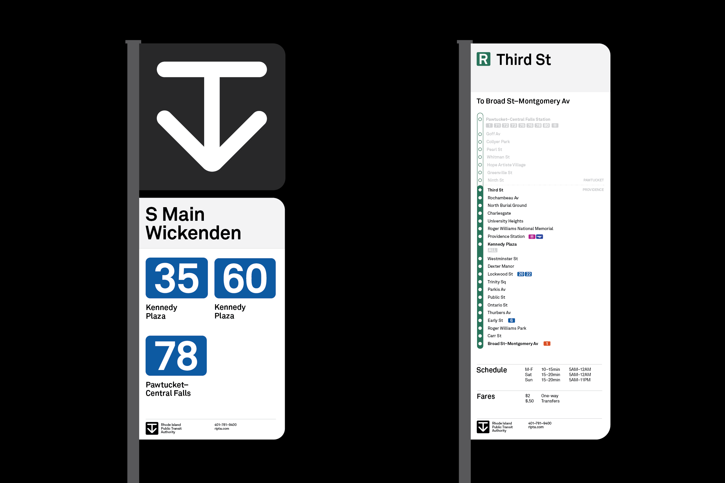
Revised bus signage and wayfinding utilizes the anchor mark in order to help passnegers quickly determine where a stop is located on the street. For the system’s R-Line, a rapid bus route, signage specifies each stops and enhanced wayfinding.


