Rochester Philharmonic Orchestra Identity
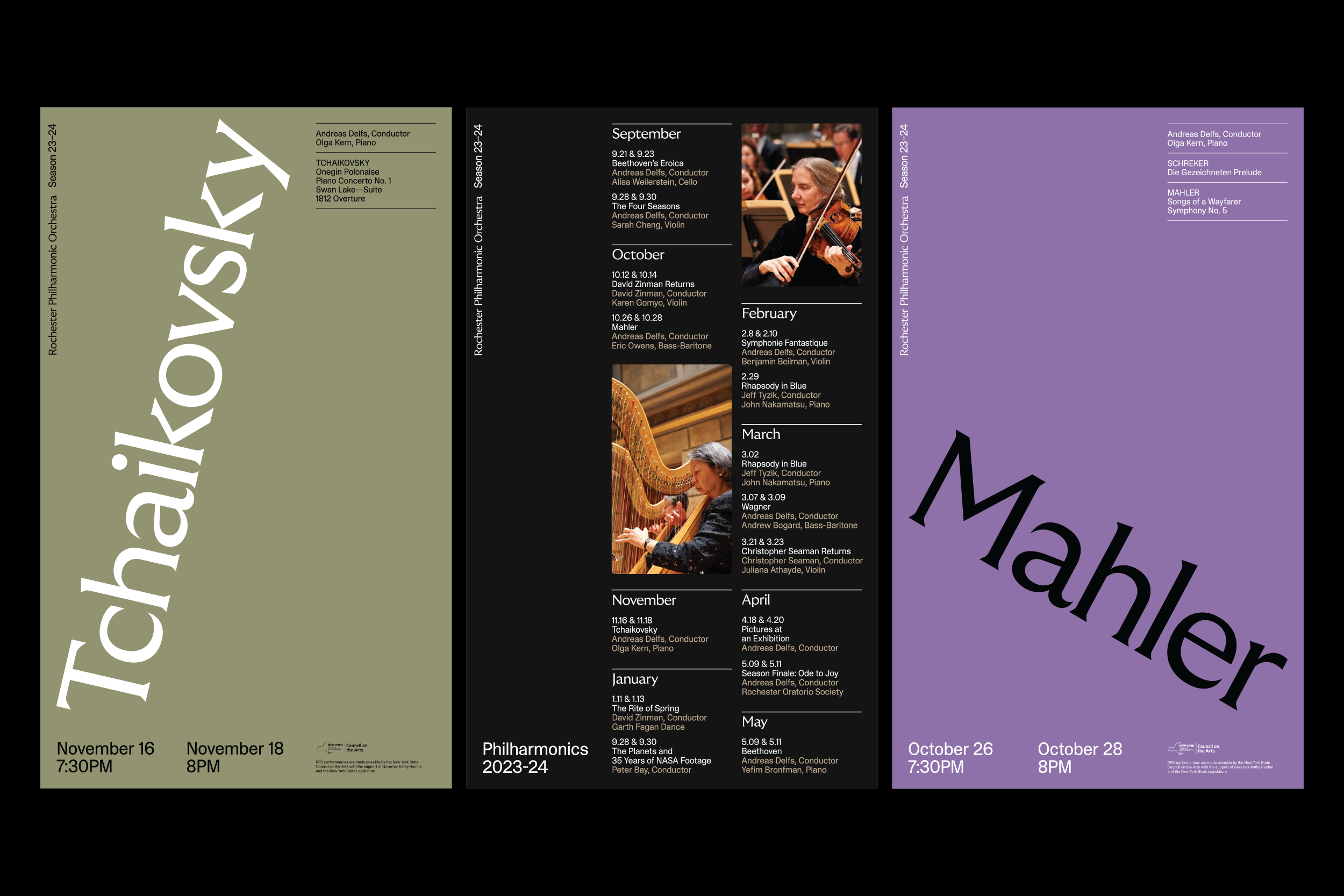
Hypothetical identity for the Rochester Philharmonic Orchestra, inspired by the movements of musicians and conductors.
Identity Design
Fonts in Use: GT Ultra Median and ABC Camera
Rochester Philharmonic Orchestra Identity
Hypothetical identity for the Rochester Philharmonic Orchestra, inspired by the movements of musicians and conductors.
Identity Design
Fonts in Use: GT Ultra Median and ABC Camera
Fonts in Use: GT Ultra Median and ABC Camera
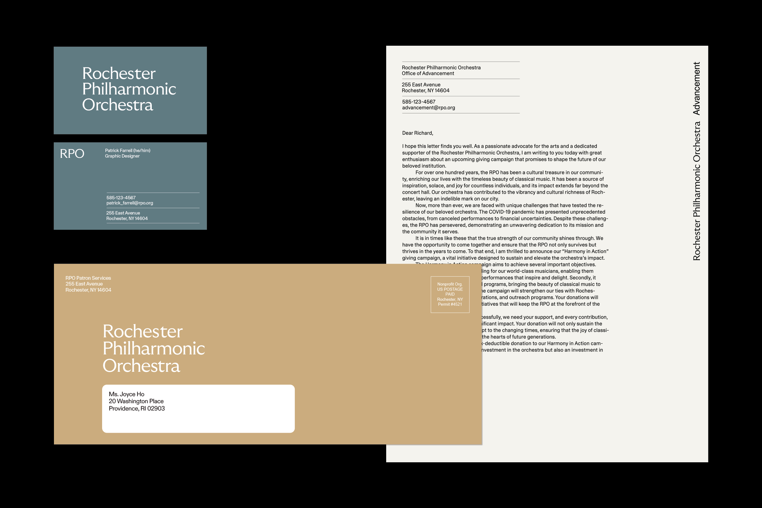
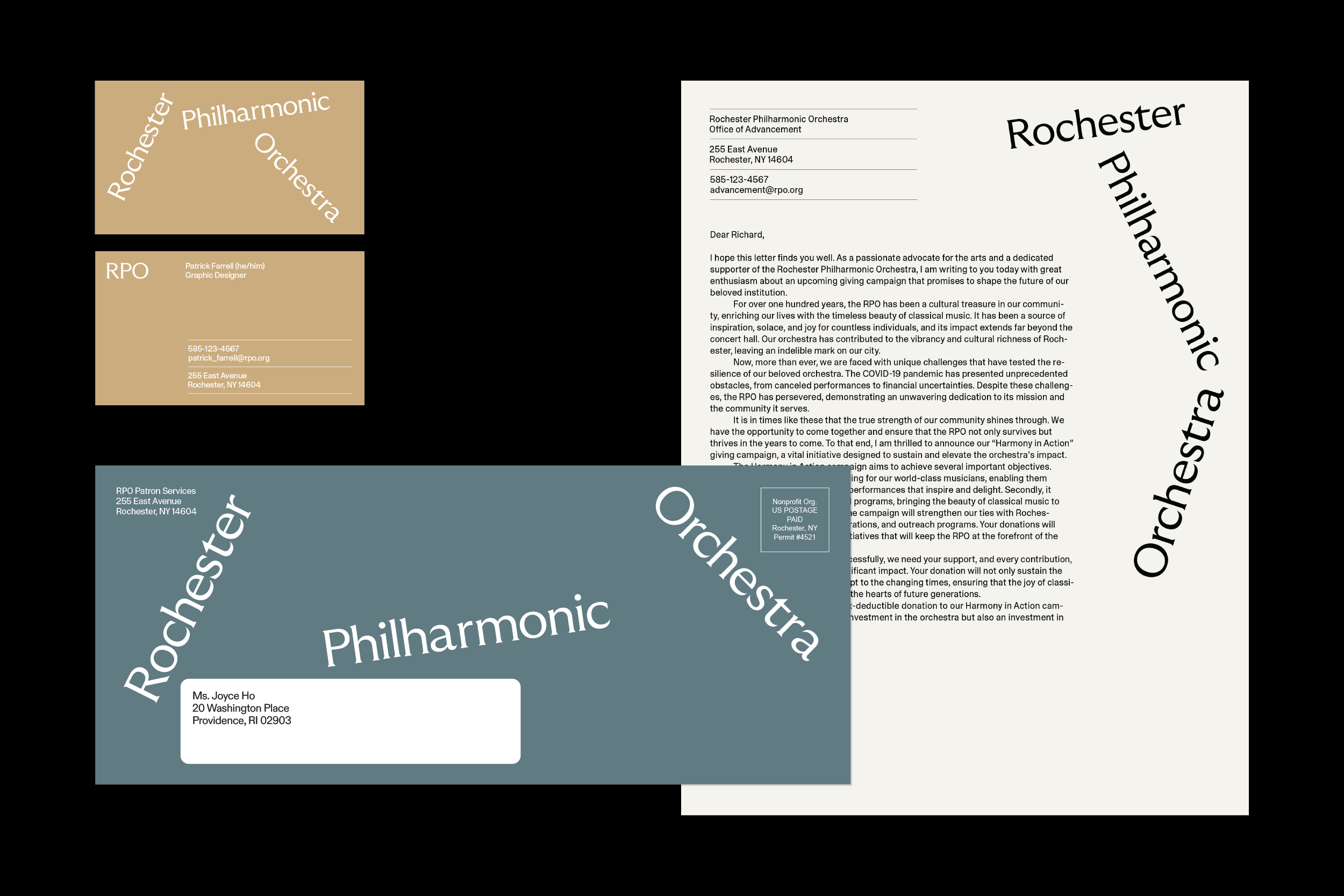
The wordmark, typeset in GT Ultra Median (referencing the marble engravings on the façade of the Eastman Theatre), positions the identity in two states: Relaxed and Active. The dynamic angles of the mark’s “Active State” mimic the movement of a baton by a conductor.


(2 Images) Both Relaxed and Active states of the logomark can be applied to any needed application within the identity, allowing the design to range from a more serious tone to a playful one.


